Beautiful Ruins is one of my favourite record sleeves made without any other design collaborators. It's one of the definitive Urban Myth Recordings titles. And one of my favorite records, period.
I had departed Toronto for NC by this time and I wasn’t around to direct Corey Bowes’ photo shoot with Chris and I was a little anxious not knowing what I’d get. When I inserted the CD-R with the photos into the tray of my wind-tunnel G4 (it was 2007 LOL) I breathed a sigh of relief that I had beautiful, cohesive images to begin working with.
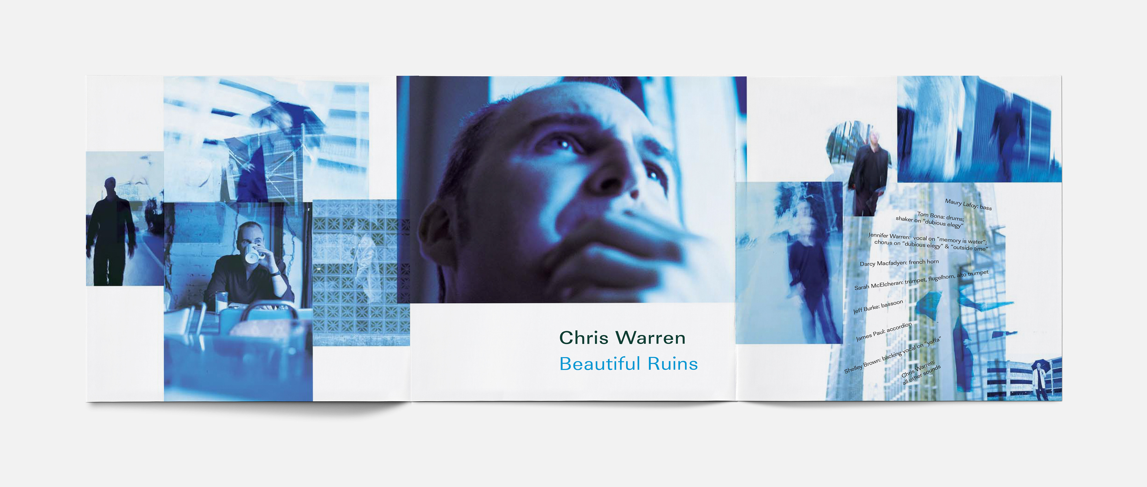
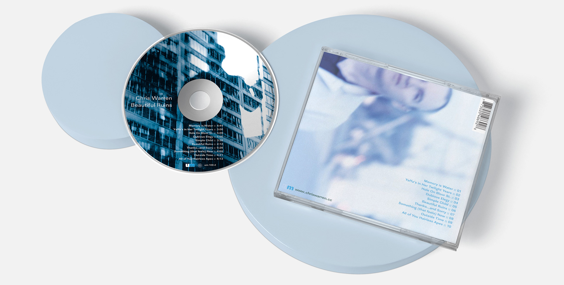
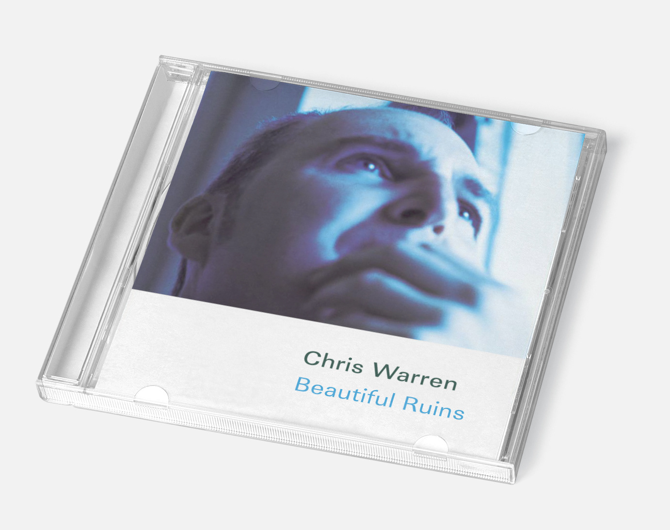
Corey captured the emotionally tentative vibe of Chris’ masterwork with images as exploratory and experimental as the performances. His indigo palette underscored the songs’ elegiac sadness in a way that hearkened back to Reid Miles’ iconic Blue Note sleeves without demanding comparison. I didn’t have to do much grading to glue these stylish images together beautifully.
In hindsight, I might have simplified the collages by dropping an image or two to recognize I was working within those ridiculously tiny 4.75” CD panels. Corey’s more esoteric shots were a proverbial embarrassment of riches so I must have felt like I wanted to include all of them.
Hopefully I made up for that overkill with the negative space on the inner spread. It helps that Chris is that rare client willing to trust (perhaps that's indulge) the occasional minimalist tendency.
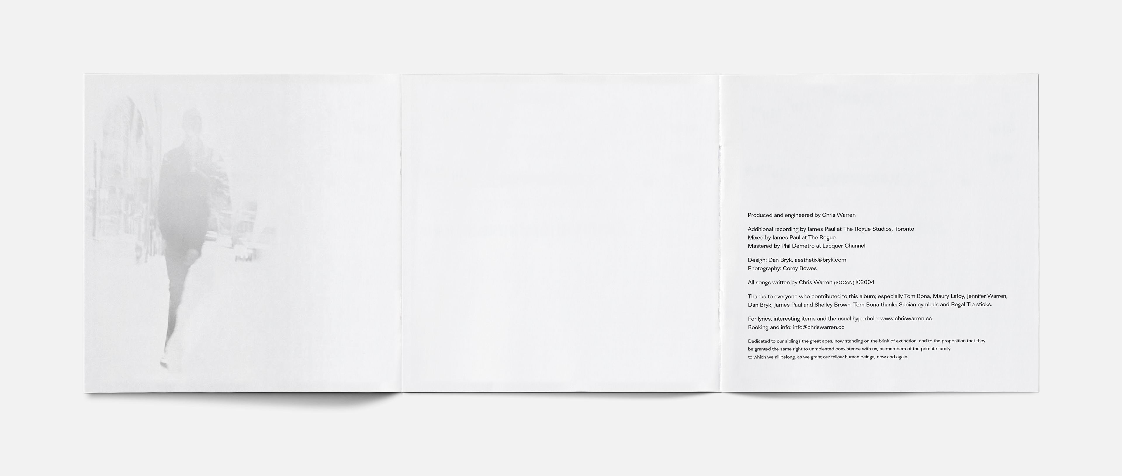
It's an absolutely reasonable impulse for a client to ask “Hey, I'm paying for that 120mm²... should we not put something there?” When I told Chris I wanted him to pay a surcharge for the clear tray beneath the disc — and then just leave it paper white — he likely smiled a wry smile and pulled out his chequebook.
I sincerely hope I get to lay out a 12" LP sleeve of this phenomenal album one day.